


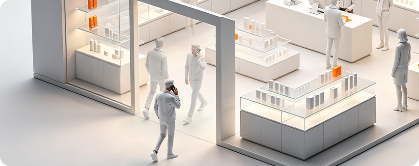
AI People Counting System
People Counting
Turn visitor traffic into smarter decisions with real-time analytics,
staff exclusion, and demographic insights.
· 99% Counting Accuracy
· Staff Exclusion & Deduplication
· Gender & Age Insights


People Counting Industry Leader


Sub Heading


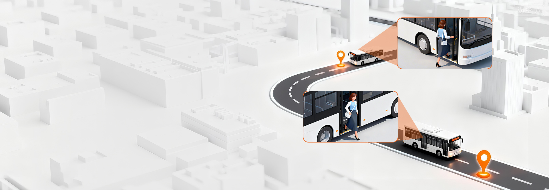
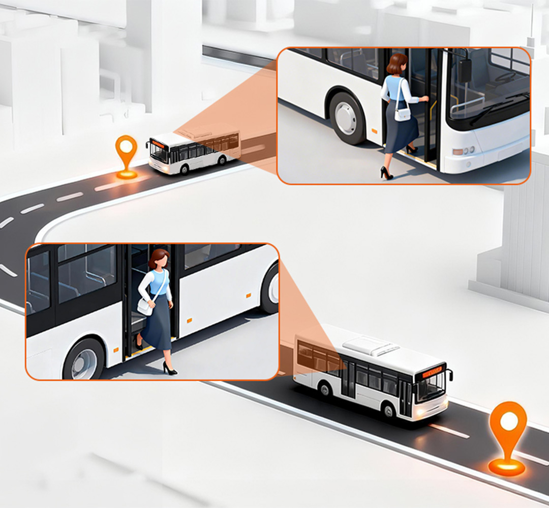
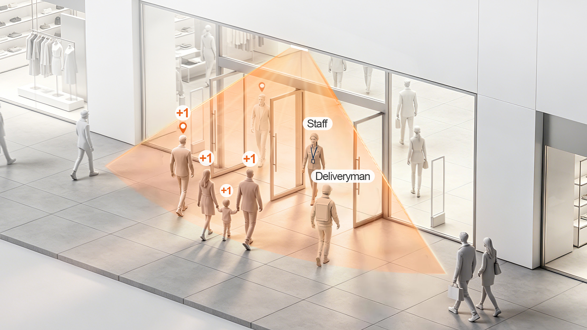
Three Critical Blind Spots of Traditional People Counting Systems
Your daily footfall reads 300, but genuine shoppers are cut in half. The issue isn’t broken hardware — it’s flawed counting logic that counts every passerby as a customer.
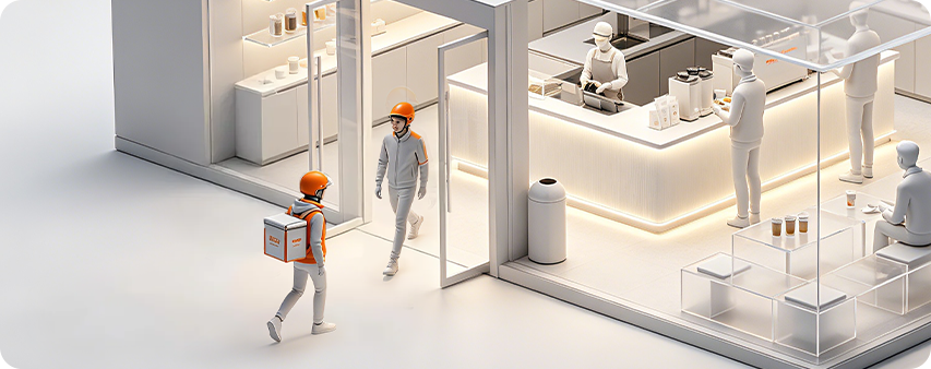
Delivery Footfall Skew
- Delivery drivers and pickup traffic inflate raw visitor counts without contributing to store sales revenue.
- Impact: Conversion rate analysis becomes inaccurate and unreliable for business decisions.
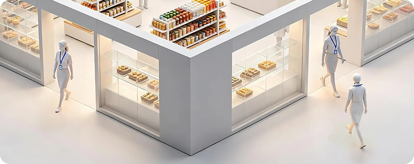
Staff Traffic Interference
- Staff moving between entrances, storage areas and service zones artificially boost total traffic volume.
- Impact: Labor scheduling and staffing plans are based on misleading traffic data.
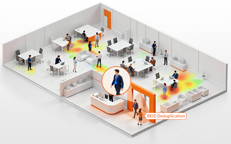
Duplicate Repeat Counting
- The same shopper gets counted multiple times after repeated entry and exit from your store.
- Impact: Marketing ROI measurement and loyal customer analysis produce biased results.
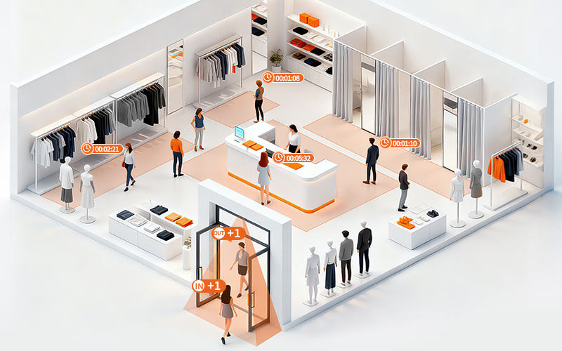
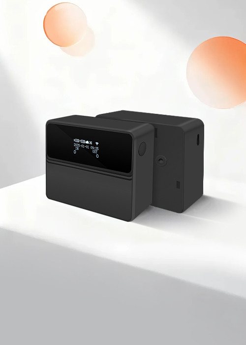
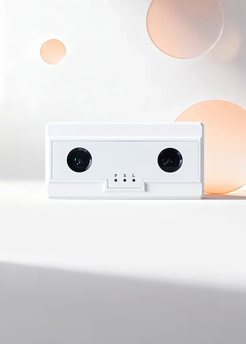
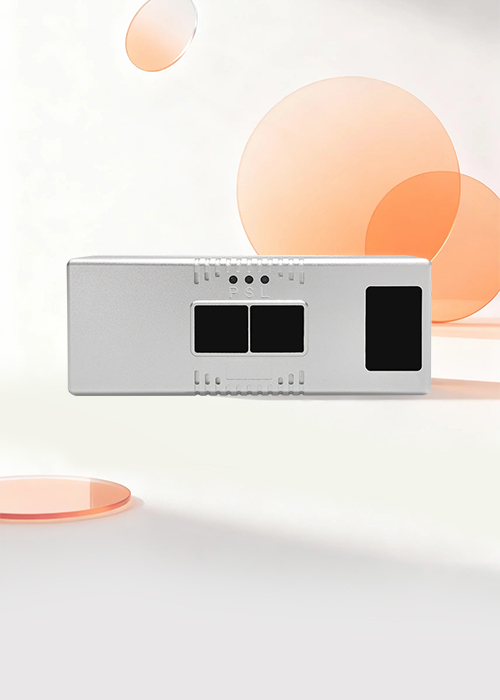
HX-CCD21 AI People Counting Terminal
Edge AI Processing
2 TOPS AI computing power for real-time local inference.
ReID Visitor Deduplication
Recognizes repeated visits and removes duplicate traffic.
Staff Exclusion
Separates employee traffic from customer visits.
Multi-Entrance Deduplication
Links multiple entrances and zones for unified visitor measurement.
Visitor Insights
Gender recognition up to 95% and age group analysis up to 80%.
Privacy-Friendly AI
Processes data locally without capturing identifiable facial images.
How People Counting Drives Business Results
Actionable insights that directly impact revenue, efficiency, and customer experience
Increase Conversion Performance
Transform traffic data into measurable sales growth.
Identify conversion gaps, optimize layouts, and maximize the value of every visitor.
Optimize Workforce Productivity
Turn visitor demand patterns into smarter workforce planning.
Align staffing levels in real time to reduce labor waste while maintaining exceptional service quality.
Elevate Customer Experience
Convert occupancy data into seamless visitor journeys.
Prevent congestion, balance crowd flow, and ensure consistent experiences across every location.
Maximize Marketing ROI
Replace assumptions with verified traffic intelligence.
Measure true campaign impact, benchmark performance, and allocate marketing budgets with confidence.
Turn Foot Traffic
Into Business Growth
FOORIR people counting system turns real-time visitor data into actionable insights that help you improve operations, increase revenue, and deliver better customer experiences.
Make Smarter Decisions
Use accurate data and analytics to plan, forecast and act with confidence.
Improve Efficiency
Optimize operations and resource allocation to reduce costs.
Understand Your Visitors
Analyze foot traffic, demographics and behavior in real time.
Enhance Experience
Improve safety, reduce wait times and create better environments.
Trusted AI People Counting System for Smarter Operations
FOORIR delivers AI-powered people counting systems, foot traffic analytics, and visitor insights to help retail, tourism, transportation, and public facilities turn visitor traffic into measurable business value.
99% Counting Accuracy
Powered by dual-lens AI technology.
Staff Exclusion & Visitor Deduplication
Measure true visitor traffic accurately.
Gender & Age Insights
Know your visitors.
Countries Covered
0 +Global deployments expanding
Brand Chain Stores
0 +Empowering retail growth
Public Transportation
0 +Improving mobility experience
Global Partners
0 +Trusted by leading brands
Culture & Tourism
0 +Enhancing visitor experience
Public Restrooms
0 +Smarter facilities management
Specialty Industries
0 +Customized industry solutions
People Counting Key Highlights
FOORIR powers precise identification and intelligent analysis
to help businesses enhance spatial efficiency and make smarter decisions
AI-Powered Precision
99% accurate visitor counting with real-time insights
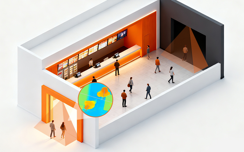
Zone Analytics
Monitor up to 4 zones with dwell time and heatmap insights
Line-crossing Counting
Track bidirectional traffic across up to 4 custom lines
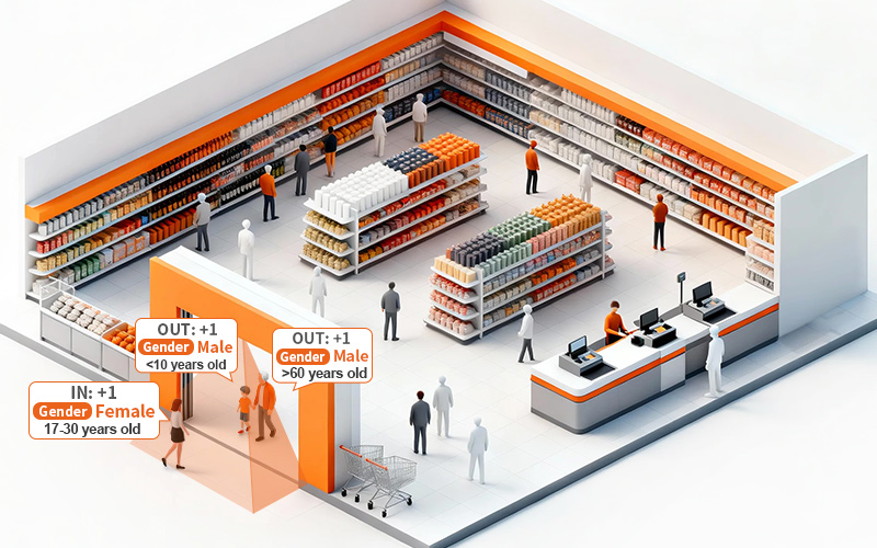
Gender & Age
Analyze visitor demographics
Adult/Child
Differentiate adults and children
Audience Insights
Understand visitor groups for smarter decisions
Visitor Deduplication
Remove duplicates to measure true visitor traffic
Staff Exclusion
Exclude employees to reveal actual customer flow
Heatmap Analysis
Visualize high-traffic zones to optimize layouts and operations
Privacy-First Design
Protect visitor privacy with depth-sensing technology
Highly Adaptable
Accurate detection even in darkness, providing stable 24/7 data
High Compatibility
Supports HTTP, Modbus, and MQTT for easy integration and development
Case Studies
Serving 1,500+ enterprise clients, we are recognized for our precise traffic analysis and data capabilities
Department Store Success Case
Digital management improvement
"Use insights to improve store performance"
Improve store operational efficiency and customer experience through data-driven strategies.
View Case >
Retail Security Success Case
Improve service efficiency
"providing more data support for store operations"
Seamless integration with existing security systems boosts overall solution competitiveness.
View Case >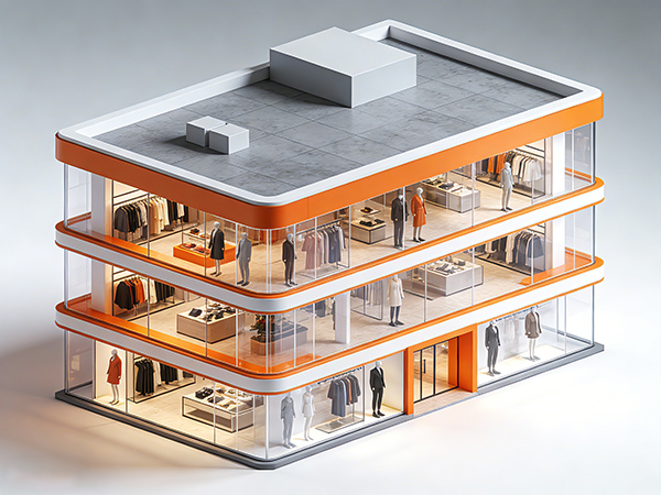
Physical Retail Success Case
boost efficiency & satisfaction
"Implement data-driven management for offline stores"
Smart traffic counters at each store entrance integrate with the POS system to enable smarter business decisions.
View Case >
Chain Store Success Case
Build a tiered management structure
"Different store types use targeted operational and promotional strategies"
Use traffic counters to ensure data consistency and evaluate strategy effectiveness.
View Case >
Smart Transport Success Case
12% Higher Fleet Efficiency
"Passenger Analytics for Data-Driven Fleet Operations"
Precision counting and GPS/route data. EYERIDE integration for actionable insights.
View Case >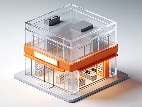
Smart Security Success Case
Service and Support
"Foot Traffic Intelligence for Large-Scale Physical Retail"
FOORIR’s 3D/AI smart sensors deliver 24/7 real-time counting (complex scenarios), cloud reports, SLA services and training.
View Case >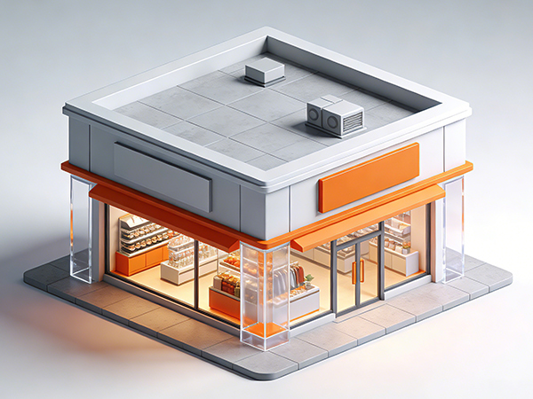

Digital Media Case
Management & Analysis
"Turn audience data into measurable media value"
Enabling digital media engagement insights, retail analysis, and seamless integration with platforms.
View Case >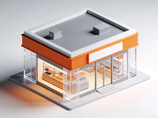
System Integrator Case
Elevate Smart Scenario Capabilities
"One data layer, multiple smart city applications"
It ensures statistical accuracy while offering strong compatibility, scalability, and flexible application across various smart scenarios..
View Case >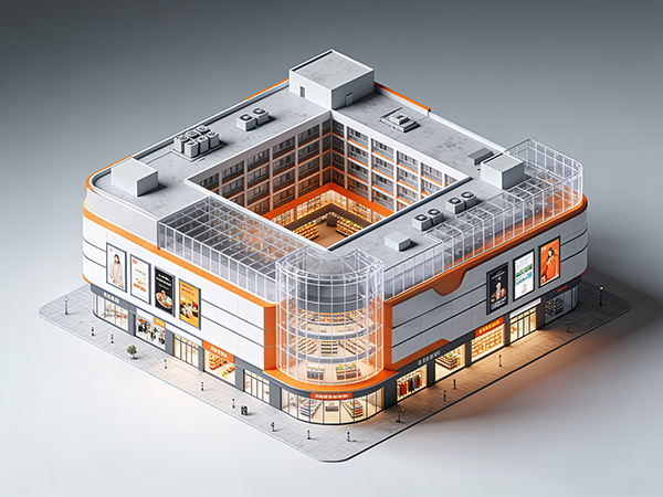
Central Retail Success Case
Data management boosts efficiency
"Enable visualized, data-driven store management"
Centralized multi-store data display and comparison greatly enhance management.
View Case >

Brunei Pavilion Success Case
Rent Assessment
"Reconstructing the booth rental assessment system using visitor flow data"
Accurate traffic data enables fair, data-driven rental pricing.
View Case >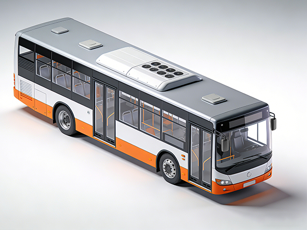

Bangkok Transit Success Case
Efficiency Optimization
"Passenger Flow Data Powers Transit Cost-Efficiency"
Centralizes real-time passenger load data to replace experience-based judgment.
View Case >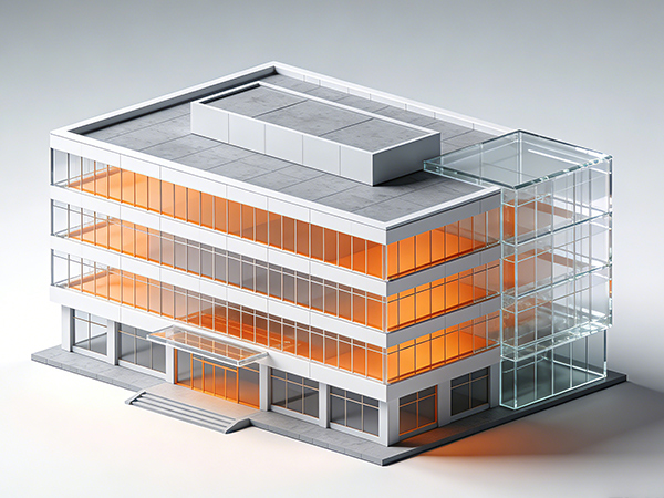
Service Enterprises Success Case
Safety Management Optimization
"Internal people flow data as a foundation for proactive security operations"
People counting equipment monitors entry and exit at key areas and runs reliably 24/7.
View Case >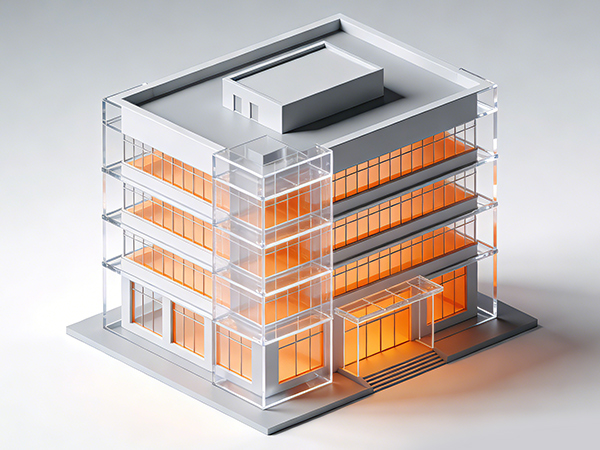

Insurance Bodies Success Case
Risk Visualization
"Enhance on-site safety operations and improve service visibility"
people counters track real-time entry, exit, and crowd distribution with data displayed on screens and platforms.
View Case >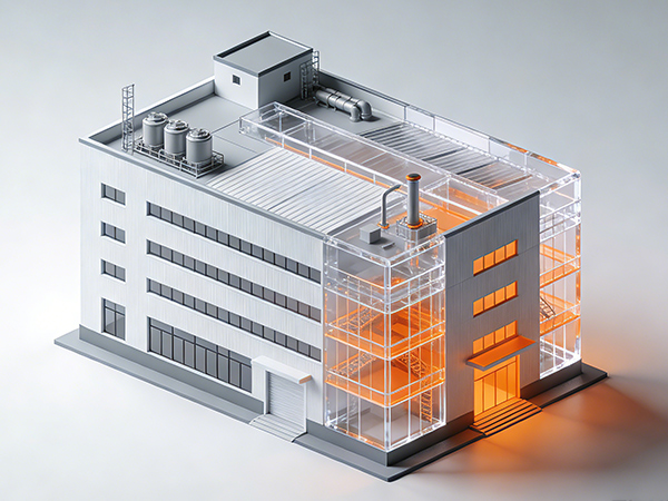

Smart Factory Success Case
Security Management
"Reshaping its personnel management model through digital means"
High-precision people counters track real-time occupancy in complex, high-traffic industrial environments, enabling closed-loop operational control.
View Case >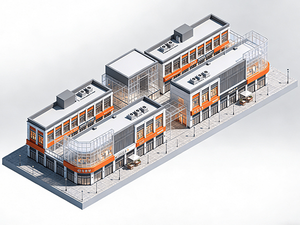

Urban Complex Success Case
Space Utilization & Business Decisions
"Optimizing Space, Experience, and Revenue Through People Flow Analytics"
Smart traffic counters track flows and generate insights for data-driven layout and resource decisions.
View Case >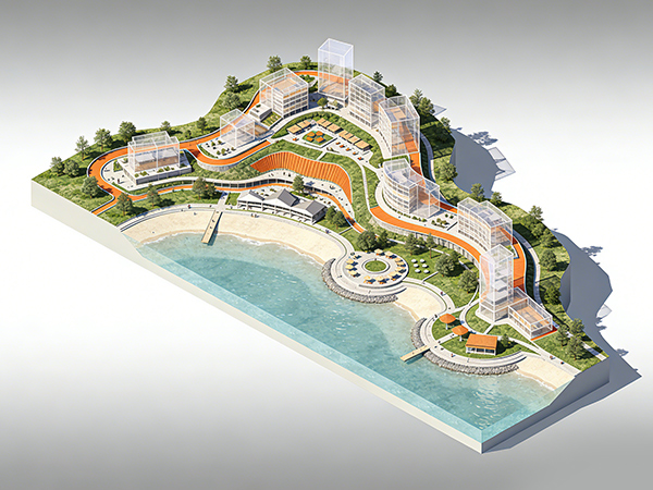

Smart Scenery Success Case
Smart Management Upgrade
"Enhancing Safety and Crowd Control Through Intelligent Visitor Flow Analytics"
This people counting system links a visual command center with capacity alerts for safer, smarter scenic operations.
View Case >People Counting Solution
FOORIR uses AI and sensors to enable intelligent pedestrian flow analysis and
smarter operations across retail, transport, and buildings
Smart Retail: Unstable store traffic and low efficiency in product display and sales guidance
FOORIR provides real-time traffic stats and heat-map insights to identify customer patterns and hotspots, enabling better retail decision-making
- Real-time insights into movement and hotspots enable better display layouts and customer flow planning.
- Accurately identify peak hours and scientifically allocate sales guides and manpower.
- Customer flow data accuracy reaches 99%, helping to steadily improve store conversion rates.
Smart Transportation : unstable passenger flow and no real-time capacity data
AI-driven flow monitoring reveals real-time density in stations and carriages, helping optimize scheduling and emergency response
- Real-time monitoring of crowd density to prevent congestion and delays.
- Data-driven scheduling system enables dynamic optimization of transportation capacity.
- AI-driven flow monitoring visualizes passenger density in stations and carriages, aiding scheduling and emergency response.
Smart Toilets: rely on experience for scheduling, have low maintenance efficiency, and suffer from serious energy waste
By analyzing passenger flow and usage frequency, dynamic cleaning schedules and intelligent energy management can be implemented
- Real-time monitoring of pedestrian traffic and usage frequency automatically triggers cleaning and maintenance.
- Data visualization and analysis to facilitate refined urban management.
- Reduce energy waste and labor costs, and enhance the image of public services.
Smart Office: low space utilization, conflicting meeting room resources, high energy costs
Monitoring flow and occupancy provides a full view of space use, supporting smart scheduling and energy savings
- Analyze the utilization rate of office areas, meeting rooms, and workstations to optimize space allocation.
- Real-time passenger flow sensing and personnel positioning ensure safety and energy efficiency.
- Data-driven human and energy management reduces operating costs.
Smart Museums: Uneven distribution of visitor experience and lack of data support for exhibition evaluation
By tracking visitor flow and hotspots in real time, exhibition layouts and traffic can be optimized for smarter management
- Real-time statistics on visitor flow and area traffic to prevent overcrowding and queues.
- Heat map analysis helps to optimize visitor flow and exhibition design.
- Data traceability facilitates exhibition evaluation and refined operation.
Smart Buildings: decentralized visitor management, imprecise energy consumption control, and fragmented operational data
Multi-point flow monitoring, integrated with access, security, and energy systems, forms a centralized space management hub
- Multi-point visitor flow monitoring provides insights into visitor distribution and activity levels.
- Integrate access control, security, and energy consumption systems to improve overall efficiency.
- Supporting building digital twins and smart park management.
Smart Gyms: large fluctuations in member traffic and uneven distribution of coaching resources
Real-time customer flow and behavior data help optimize staffing and marketing for a smarter fitness experience
- Use real-time attendee stats to optimize coach assignments and resource allocation.
- Analyzing member activity and repurchase trends helps in targeted marketing.
- Optimize site utilization to improve customer satisfaction and operational revenue.
Smart Ships: Uneven passenger flow and inefficient management of decks and cabins in ship operations
Real-time people counts and heat maps reveal movement patterns and stay times, enabling smarter and more efficient ferry scheduling
- Real-time passenger movement insights and hotspot detection help optimize deck and cabin layouts.
- Accurate peak-time identification enables smarter staffing for boarding and dining.
- With up to 99% counting accuracy, ships can service quality and operational efficiency.
Smart Factory: Uneven workshop staffing causes inefficiency and safety risks
Monitor personnel flow in real time to improve safety and efficiency
- Visualize key-area personnel density to spot risks early.
- Highlight production peaks and valleys for better scheduling and inspections.
- Drive refined workshop management based on data.
Smart Tourism: Crowds and long queues hurt visitor experience
Use real-time visitor flow to simplify scenic area management
- Dynamic visitor distribution to spot busy and quiet areas.
- High-traffic alerts for efficient guidance, staffing, and services.
- Smooth visitor experience with stable, controlled operations.
Smart Mall: Rapid traffic changes and slow staff response hinder operations
Real-time customer insights improve efficiency and decision-making
- Visualize movement patterns to optimize displays and layouts
- Peak hour analysis ensures staff allocation matches traffic
- Efficient crowd management stabilizes mall operations
Smart Transit Hub: Crowded areas, long security lines, and rigid management slow operations
Digitized passenger flow data enables refined management
- Monitor density and flow in real time to reduce congestion.
- Identify peak times for flexible checkpoint and service counter allocation.
- Enhance traffic efficiency and ensure a smoother passenger experience.
Smart Exhibition: Crowded halls and congestion hinder smooth operations
Real-time crowd monitoring improves order, efficiency, and sustainability
- Monitor density to quickly identify congested and underused areas.
- Analyze peak entry times, dwell times, and visitor flow paths.
- Use data to evaluate area attractiveness and optimize booth layouts.
OD Passenger Flow: Digital transformation of public transport using real travel data
High-precision boarding and alighting data improves service
- Adjust departure frequency and schedules based on real OD data.
- Optimize strategies for peak and off-peak hours, reducing resource waste.
- Ease congestion, shorten waiting times, and improve punctuality.
Products
From hardware data collection to cloud analytics, FOORIR has built a complete ecosystem for people counting
People Counting Analytics Platform
Turn people counting data into actionable insights with real-time analytics, visitor demographics, and custom reporting.

Visitor Analytics
Track visitor gender, age, trends and peak hours.

Multi-dimensional Reports
Export by region, time, trend, etc.

Open Integration
API/MQTT/Modbus, easily integrate with existing systems.
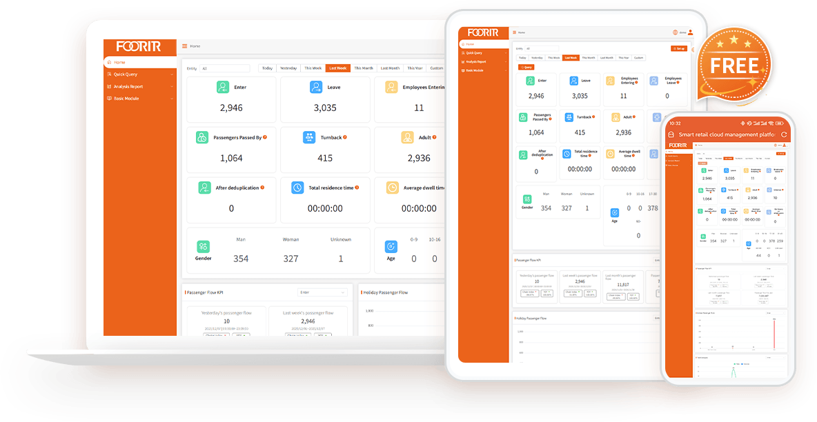

99% Accuracy
Accurate people counting

Staff Exclusion
Exclude staff traffic

Visitor Deduplication
Eliminate duplicate visitor

Trend Analysis
Analyze visitor flow trends

Custom Dashboard
Flexible dashboard
People Counting FAQs
Quick guide to the most common questions about people-counting technology
1. What is a people counting system?
A people counting system measures visitor traffic in physical spaces using AI sensors and analytics. Businesses use people counting systems to understand foot traffic, occupancy, visitor behaviour, and conversion performance in retail stores, shopping malls, museums, transportation hubs, and public buildings.
2. How accurate is FOORIR’s people counting system?
FOORIR delivers up to 99% counting accuracy using dual-lens 3D AI technology. Unlike traditional infrared or monocular systems, our solution reduces counting errors caused by crowding, poor lighting, and complex movement patterns.
3. Does FOORIR support gender and age recognition?
Yes. FOORIR provides gender and age recognition to help businesses understand visitor demographics. These insights support smarter merchandising, marketing campaigns, and operational decisions.
4. Which people counting technology is best for my business?
The best people counting solution depends on your data needs, application scenarios and budget. We provide infrared, 3D AI, ToF and millimeter-wave radar counters, each with distinct features, accuracy and pricing.
5. How to apply gender and age data to actual operations?
By people counting system generating richer population portraits and conducting deeper data analysis, it is helpful to formulate more targeted marketing strategies, such as promotional activities for specific age groups, or optimizing store layout to attract target customer groups.
6. Can the FOORIR people counter distinguish visitor groups?
FOORIR can count the corresponding visitor groups as one through the functions of family members, individuals, and batch personnel.
7. Does your people counter support API?
FOORIR people counters all support API docking, and the devices are equipped with API interface protocols as standard. The main docking methods include TCP IP/HTTPS Post/Modbus RTU/Modbus TCP.
8. Does FOORIR support visitor deduplication?
Yes. FOORIR uses AI visitor deduplication technology to identify repeat visitors and remove duplicate counts across entrances or multiple devices. This helps businesses measure true unique visitors more accurately.
9.Can FOORIR exclude employees from visitor counting?
Yes. FOORIR supports staff exclusion technology to automatically remove employees from visitor analytics. Businesses can use badges, tags, or AI-based identification to avoid inflated traffic data and improve reporting accuracy.
10. Can FOORIR count adults and children separately?
Yes. FOORIR supports adult and child classification, allowing businesses to analyse family traffic patterns in retail, museums, attractions, and public venues.
11. Does your people counter sensor support bidirectional statistics?
FOORIR people counter can count the number of people entering and leaving the store, the number of people passing through the store, number of people staying, number of people returning, number of people in the area, family, individual, and batch of people.
12.What is the difference between a people counter and foot traffic analytics?
A people counter measures how many visitors enter a location, while foot traffic analytics provides deeper insights such as visitor flow, dwell time, repeat visits, demographics, and occupancy trends. FOORIR combines both in one AI platform.
Blog News
Explore the latest technologies, industry trends, and application cases in passenger flow statistics
and Internet of Things (IoT) intelligent sensing.
Discover the Value of Real Customer Traffic Analytics
Make Data-Driven Business Choices Using True Customer Footfall Insights